Elevating user engagement through intentional design
Overview
OnPlay is a cross-platform entertainment app that had already been in the market, but struggled with low engagement, inconsistent visuals, and a fragmented user experience. The team planned a full relaunch and needed a complete redesign that improved clarity, modernized the visual language, and created a scalable system across iOS and Android – without adding engineering risk.
Scope: End-to-end product design – UX audit, design system, UI redesign, dev handoff
Team: 1 founder, 1 PM, 3 developers, 1 designer (me)
Timeline: ~3 months
 TL;DR
TL;DR
The challenge
The existing product suffered from:
- Visual noise and inconsistent component patterns
- No unified hierarchy, making it difficult for users to understand where to go next
- Poor feature discoverability
- Overloaded screens with no spacing logic
- Old, outdated UI that reduced trust and perceived value
The Process
1. Branding overhaul
The logo and all the branding elements looked completely outdated. I did a complete overhaul of the brand's visual language creating new, fresh and dynamic brand identity.
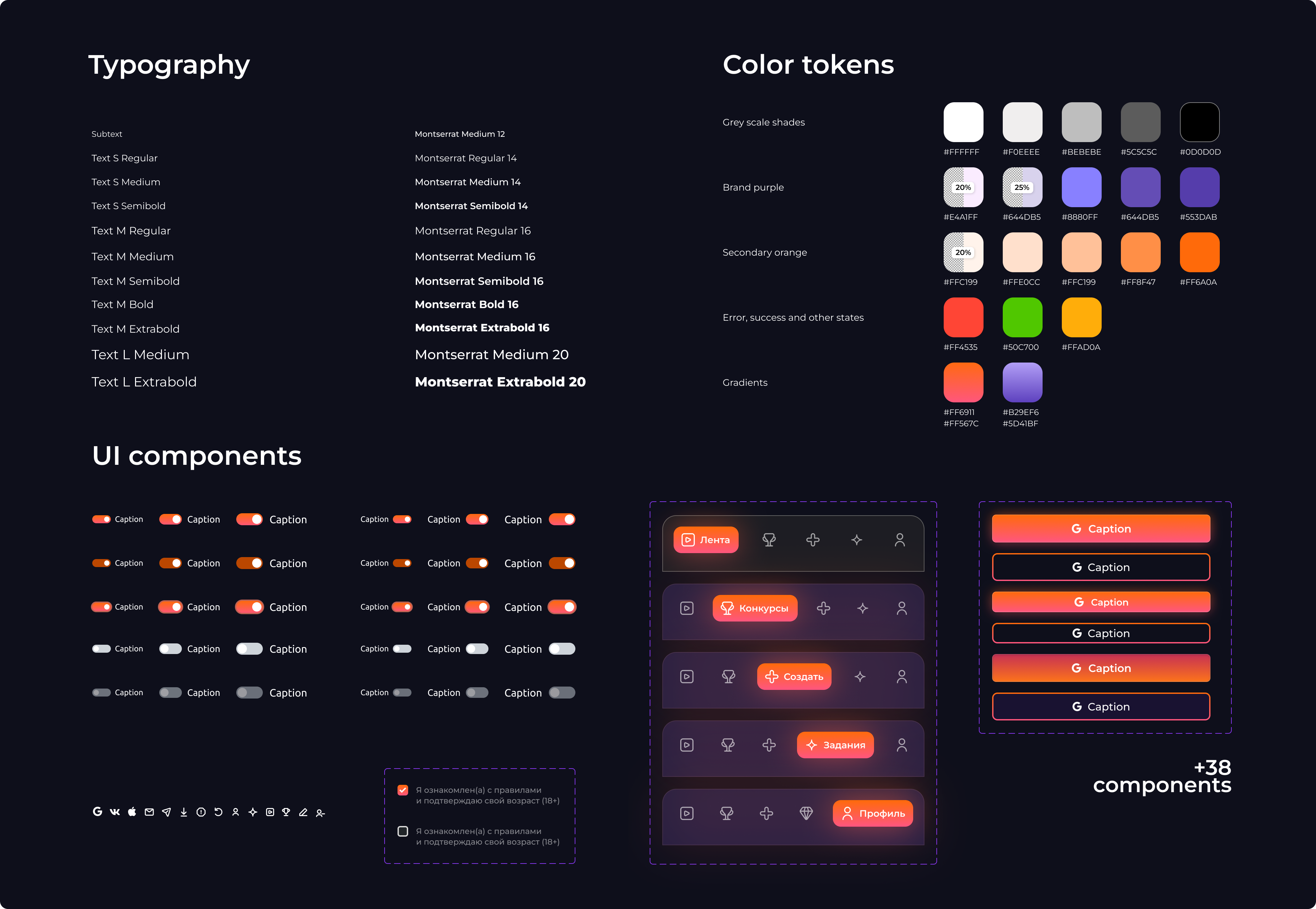
2. UI kit
I created a clean and reusable light-weight UI kit consistent across all mobile platforms.
3. UX audit
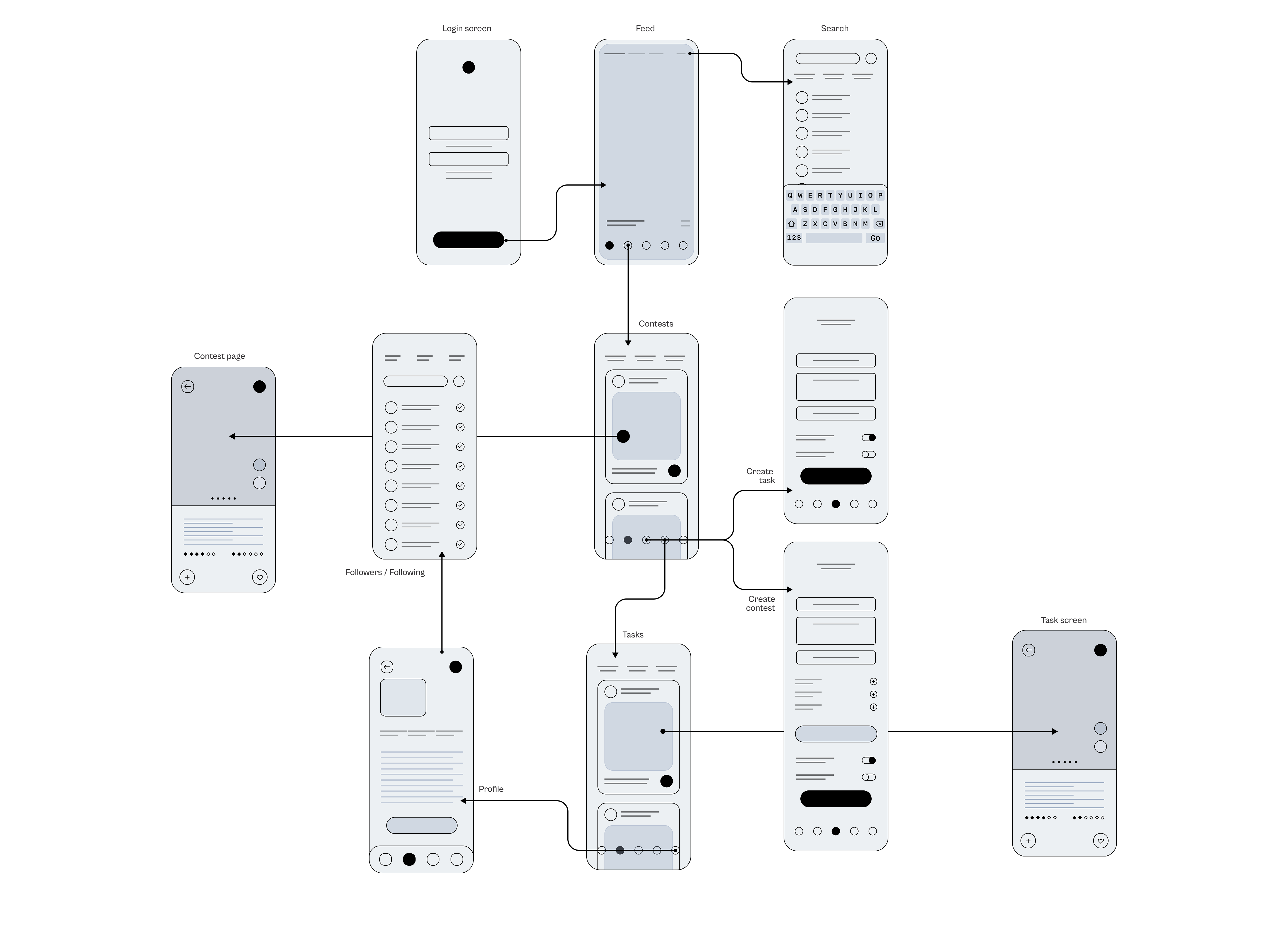
I started by analyzing the current product:
- Mapped all the key screens and identified inconsistent interaction patterns
- Tracked friction points where users hesitated or stalled using Hotjar
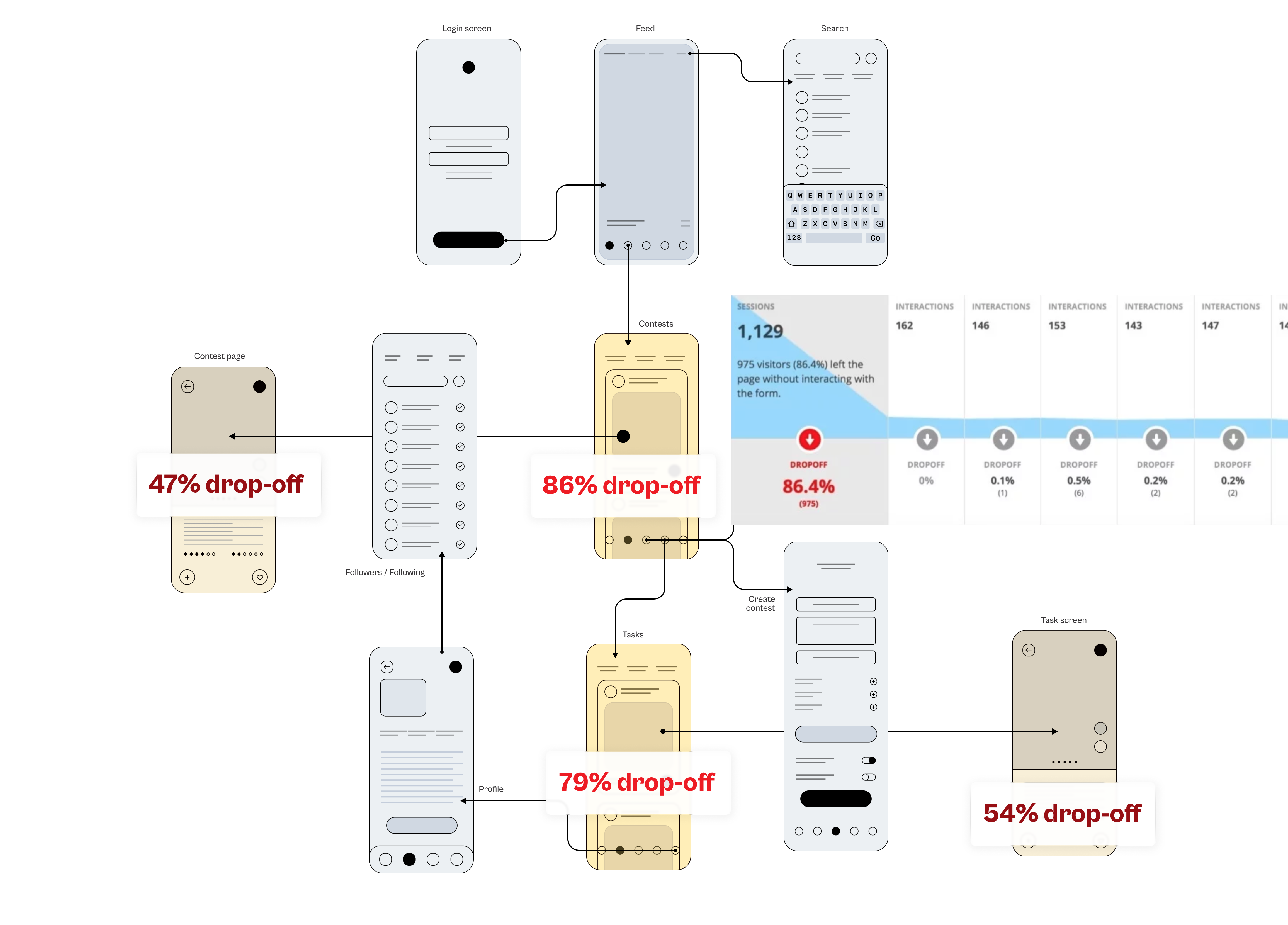
Turned out two key screens (Task feed and Contest feed) had insane drop-off rates of up to 86% according to Hotjar. The rest of the funnel just didn't matter until this problem was addressed.
Individual assignments and contest screens also had a drop-off rate close to 50% which was another major problem.
I recruited users for tests from Useberry, observed their behaviour and gathered feedback. This is what users had to say about Tasks and Contests screens:
 User 1:
User 2:
User 3:
User 1:
User 2:
User 3:
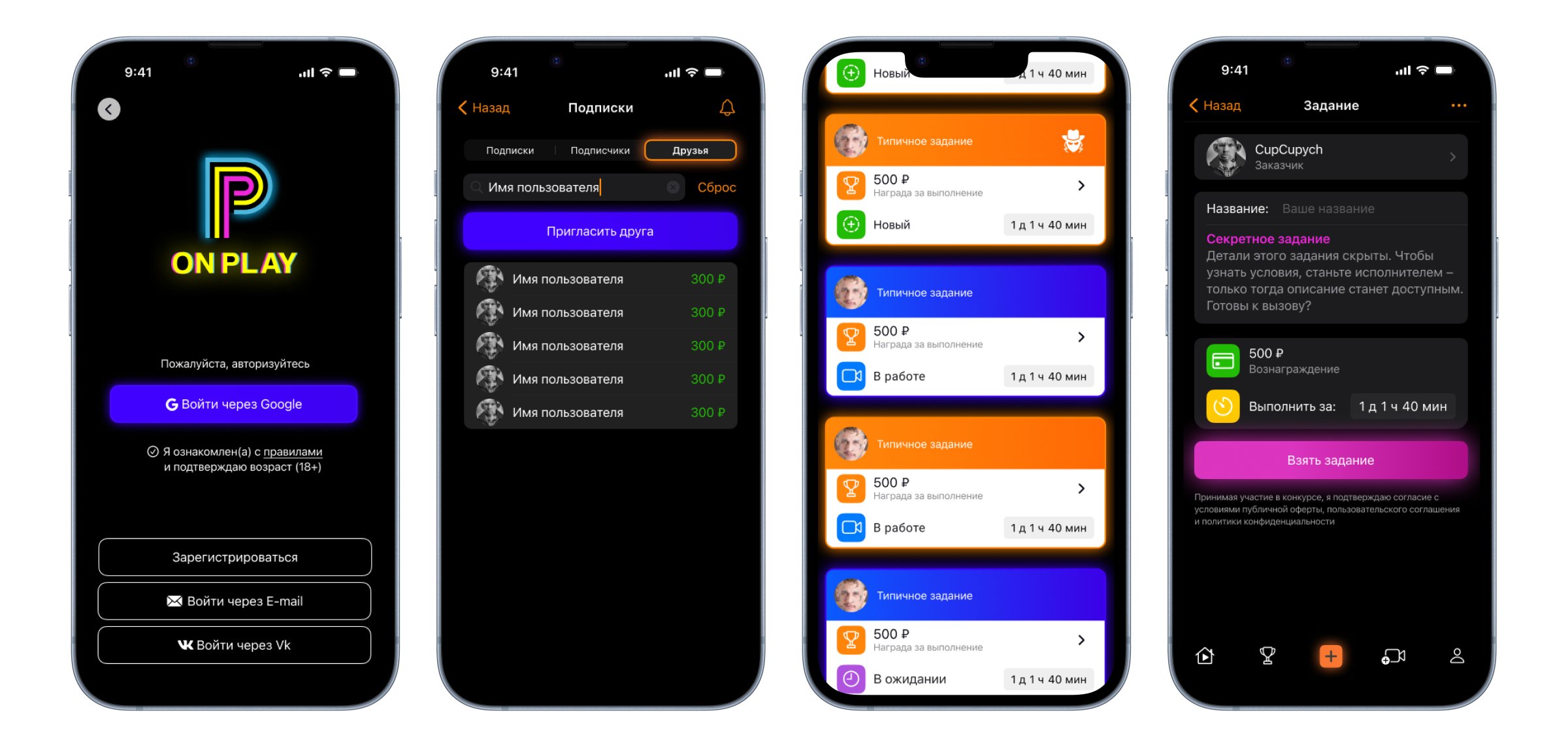
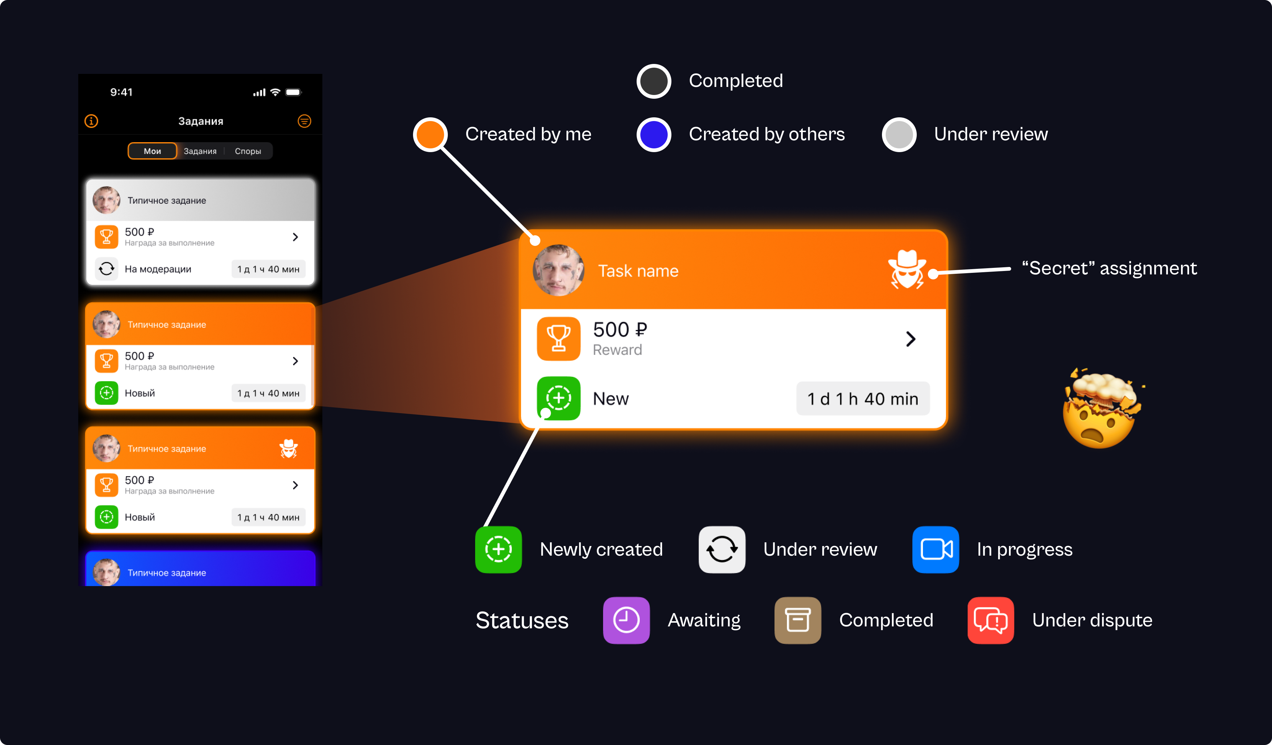
As the diagram below shows, the task cards were designed in a very confusing way:
- Some statuses are indicated by the card’s background color — something the user would never intuitively understand.
- Other statuses are shown with status icons, and some of those icons simply duplicate the color indication (for no clear purpose).
- The task creator’s name isn’t visible — only the avatar.
- “Secret” tasks (tasks where the description is hidden until you pick them up) are marked with an icon that’s not intuitive at all.
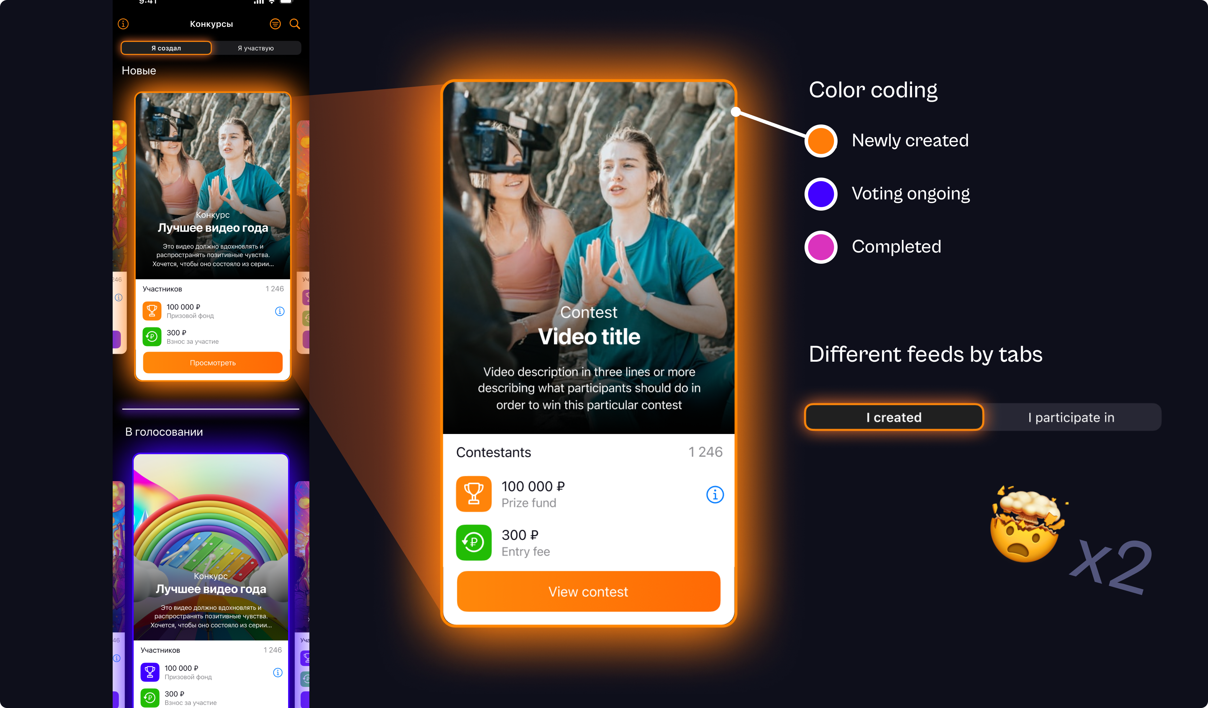
Now, the Contests screen didn't make things better. It was a complete UX disaster.
- The color coding on this screen not only introduced an entirely new pink color for an existing status (“Completed”), but the colors also didn’t match the status colors used on the previous screen.
- There’s no separate tab for contests created by other users. They show up in the "I take part in" tab even when the user isn’t actually participating in them.
- The task creator’s name or even his avatar isn’t visible.
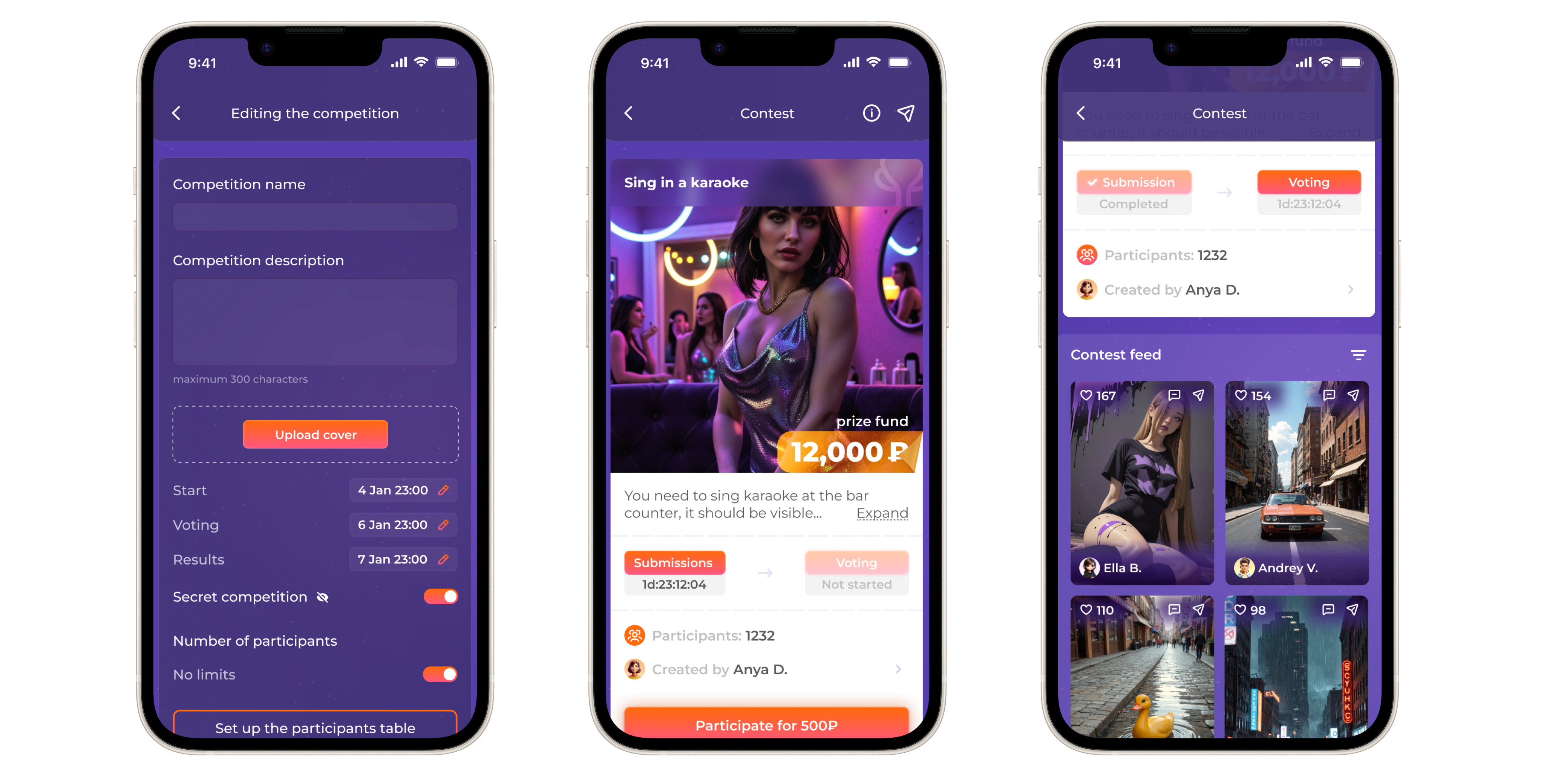
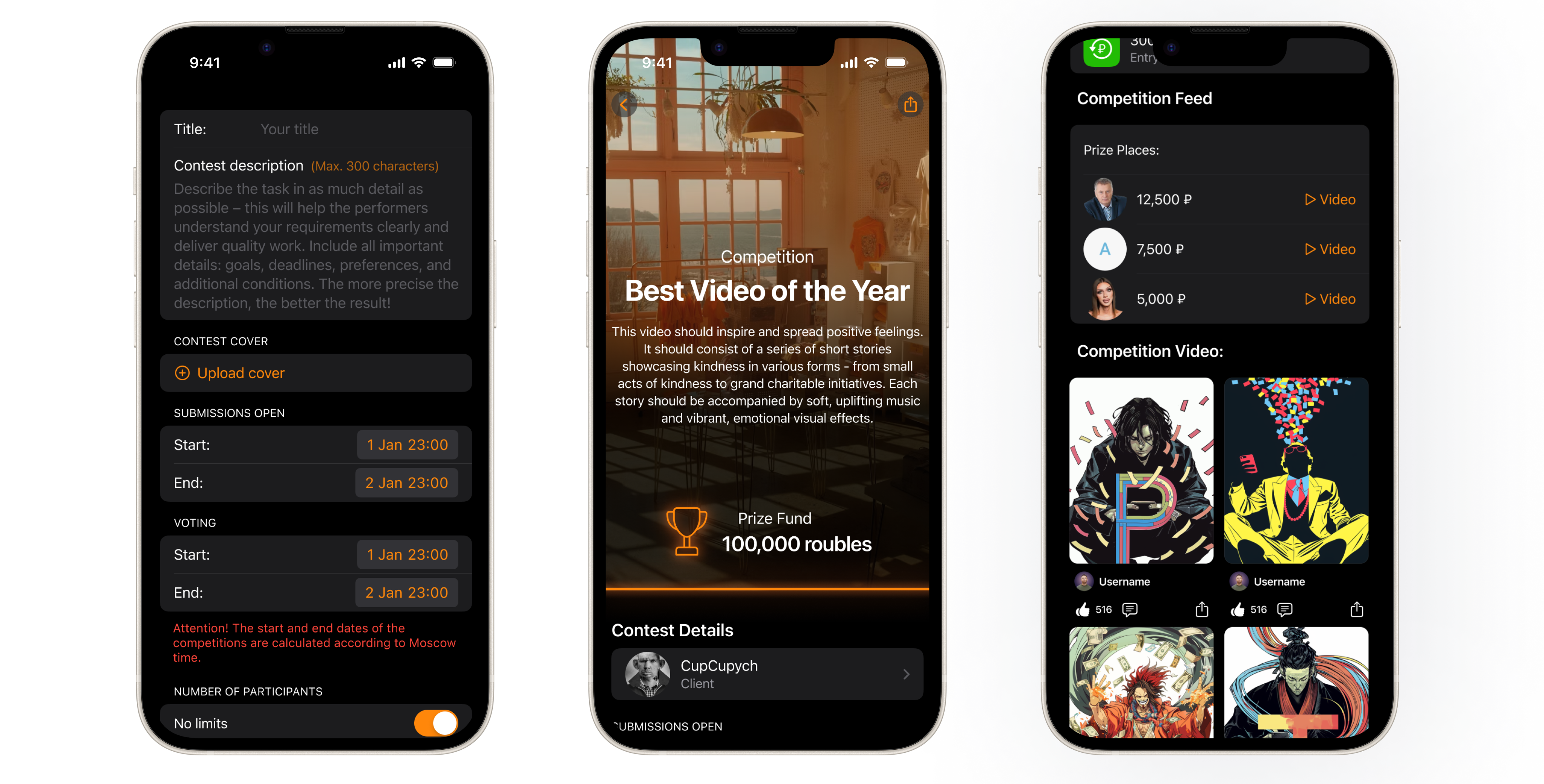
3. Redesign
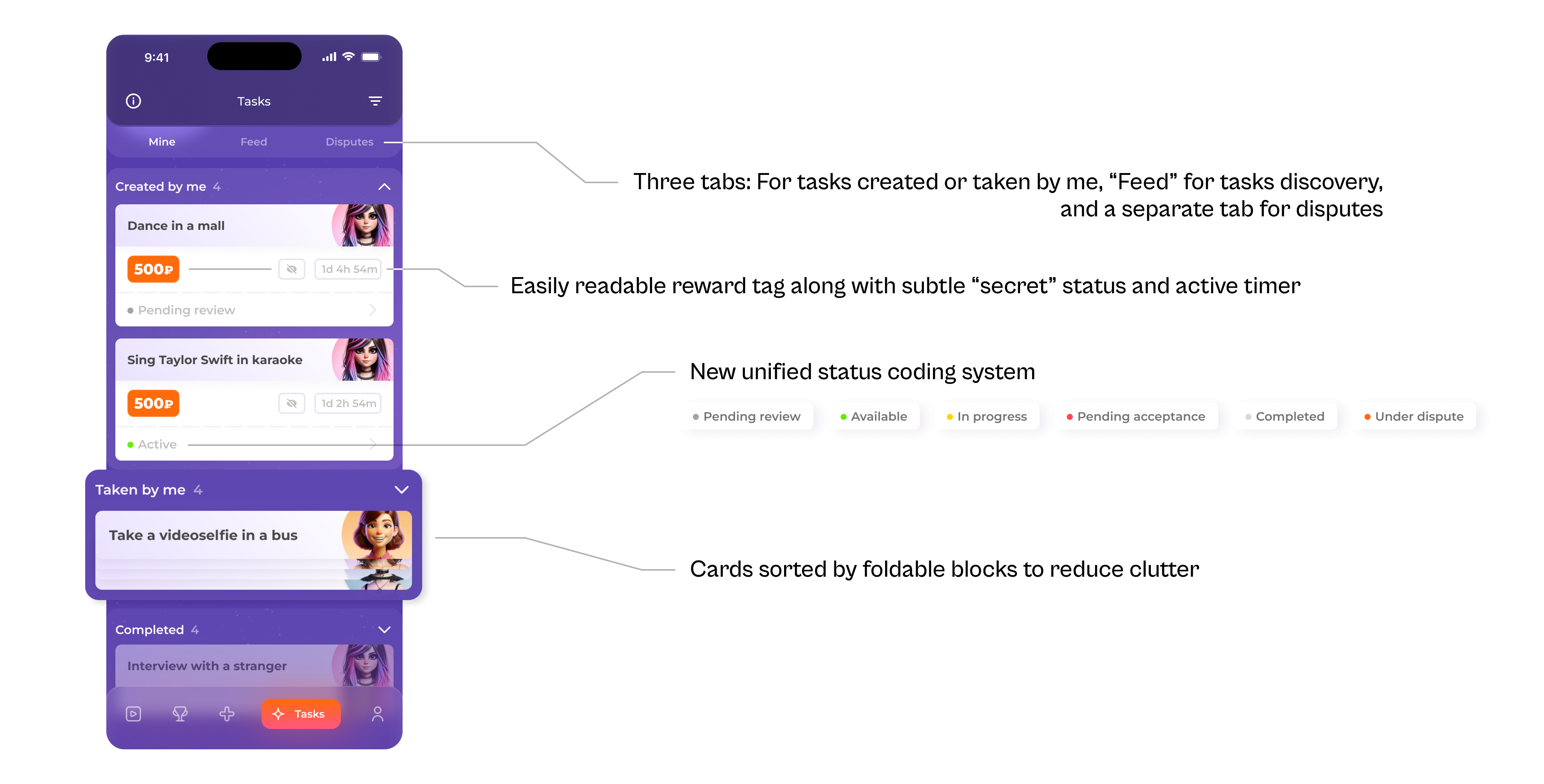
I focused on the biggest painpoints — Tasks and Contests screen. Confusion came from a lot of status info that needed to be conveyed through the cards. First, I categorized all that we needed to indicate. For Tasks screen it was:
- Created by: me / others.
- Completion status: under review / new (not taken by anyone) / in progress / awaiting acceptance / completed / under dispute.
- “Secret” task / normal task.
- Creator's profile pic.
- Reward.
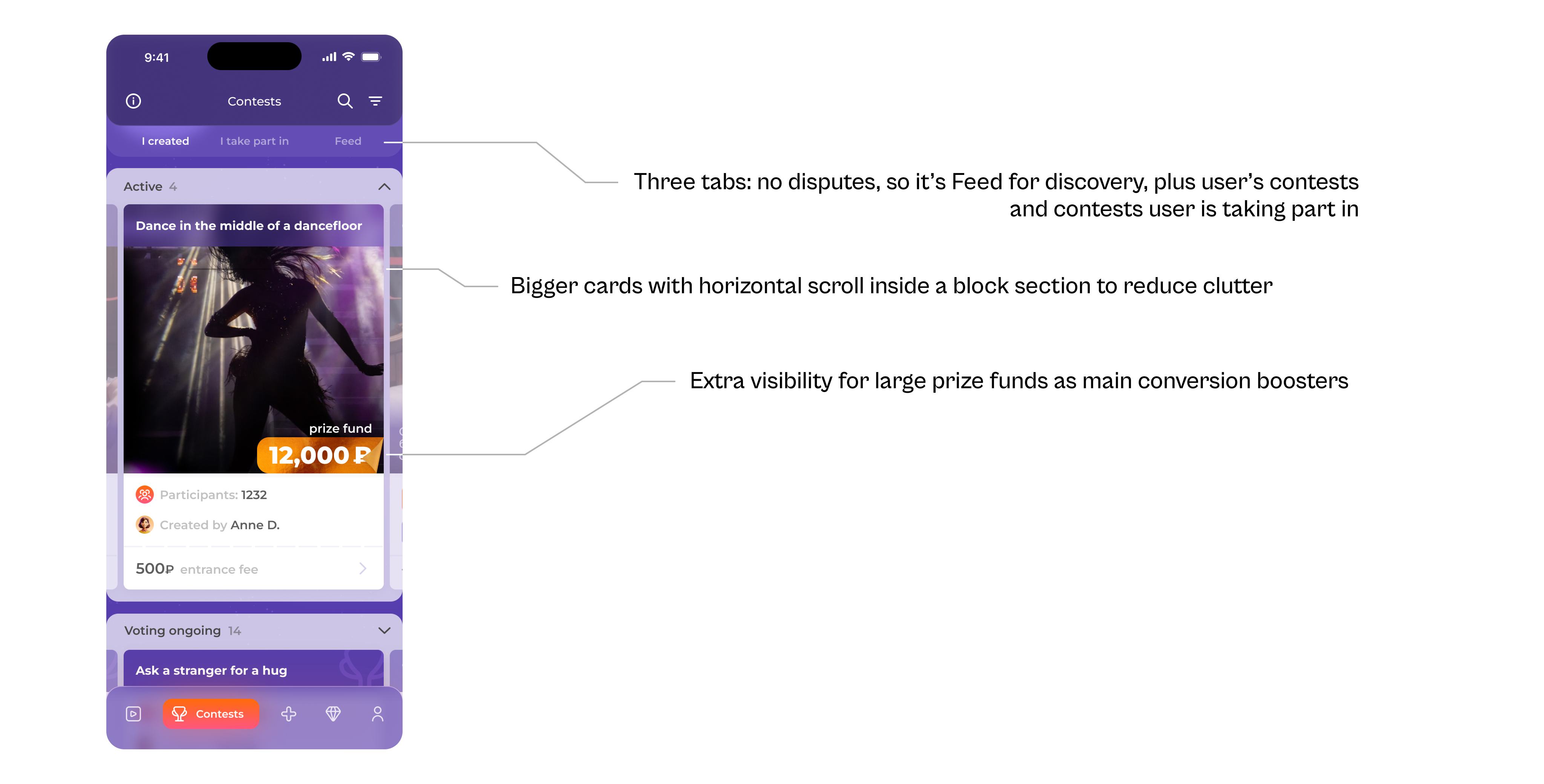
For contests we added the following:
- Number of participants as an engagement metric and social proof.
- Larger prize label as main conversion point (prize funds are much bigger for contests).
- Creator's name.
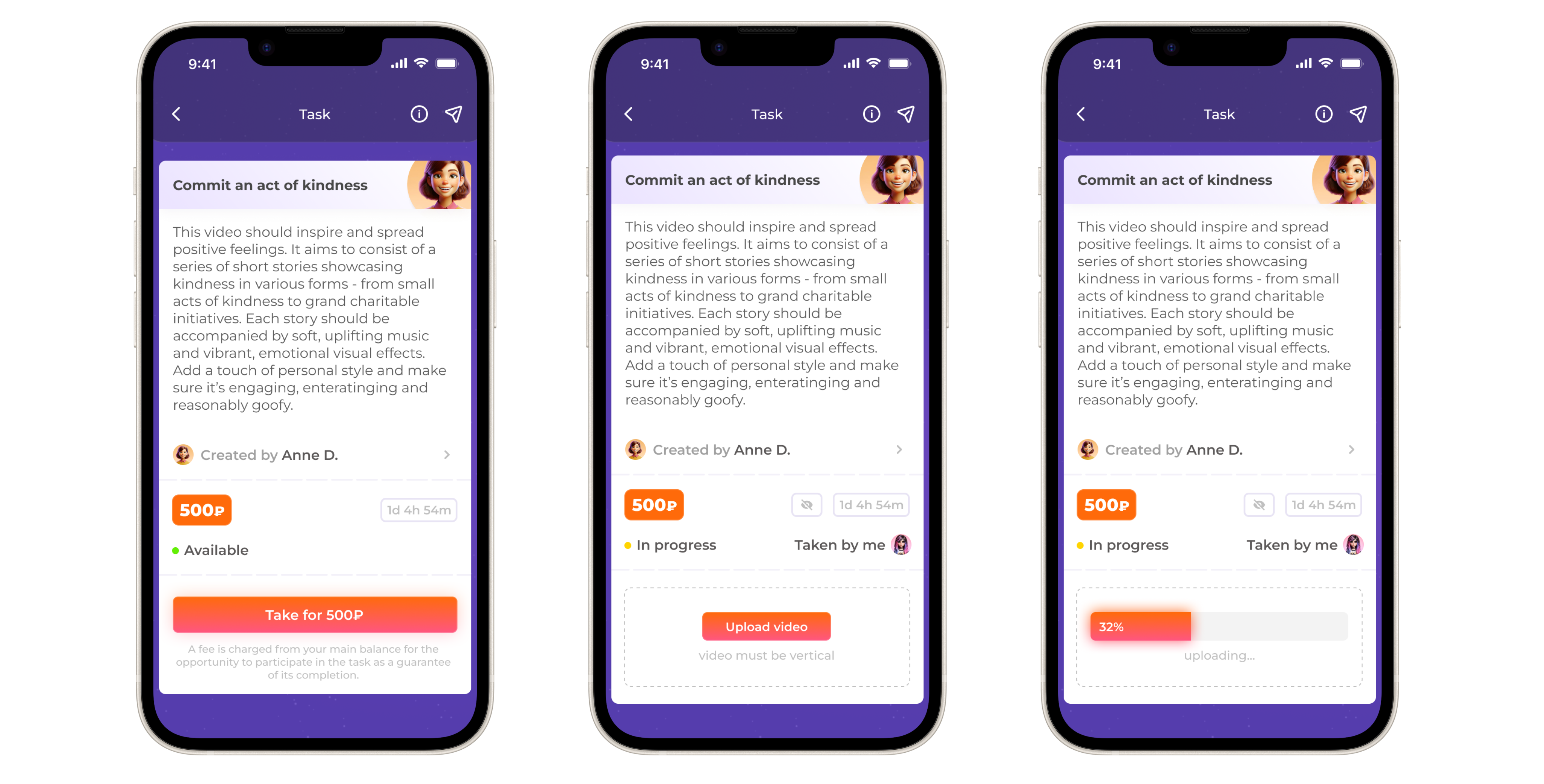
Individual Task screens:
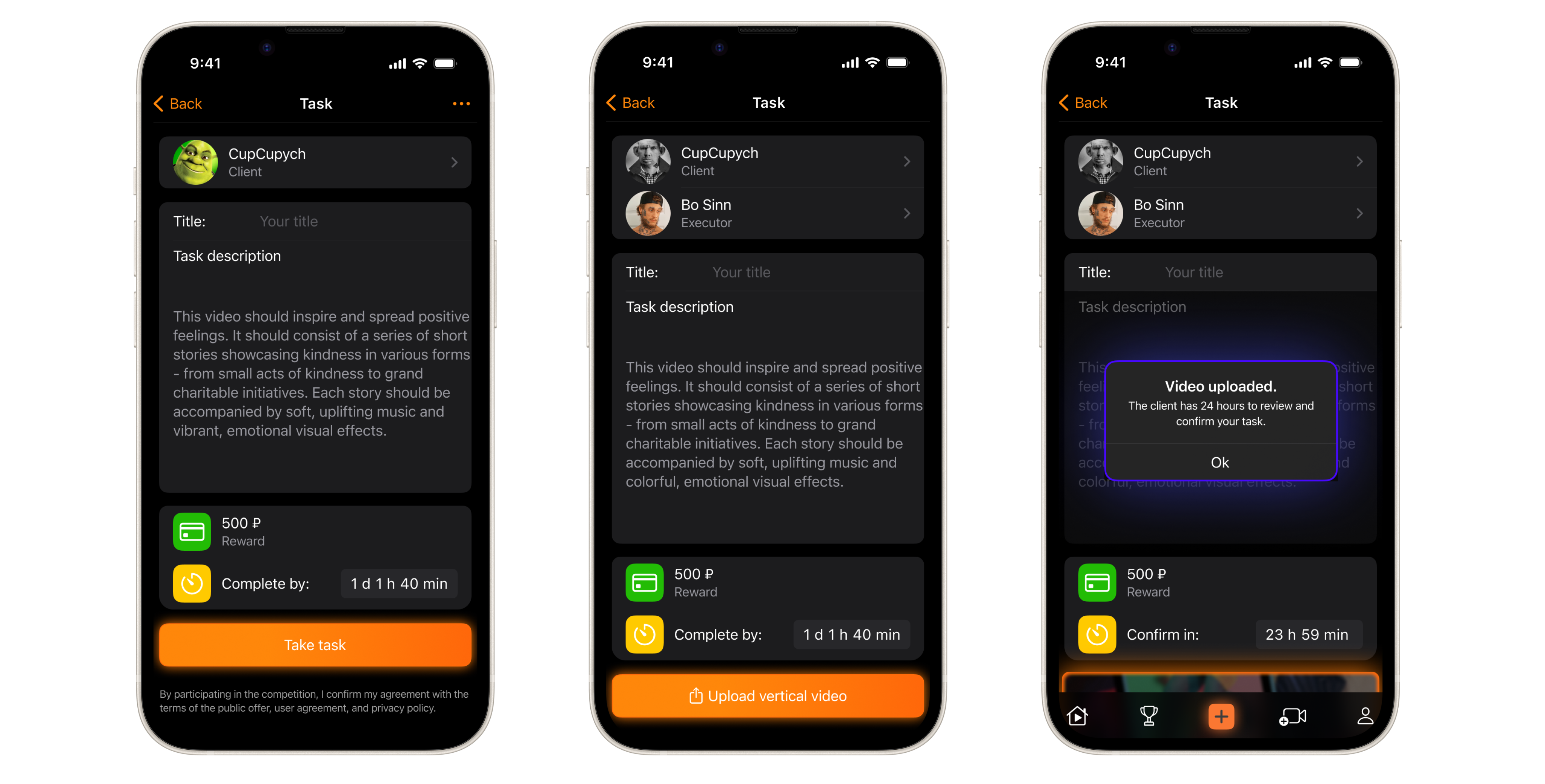
Individual Contest screens:
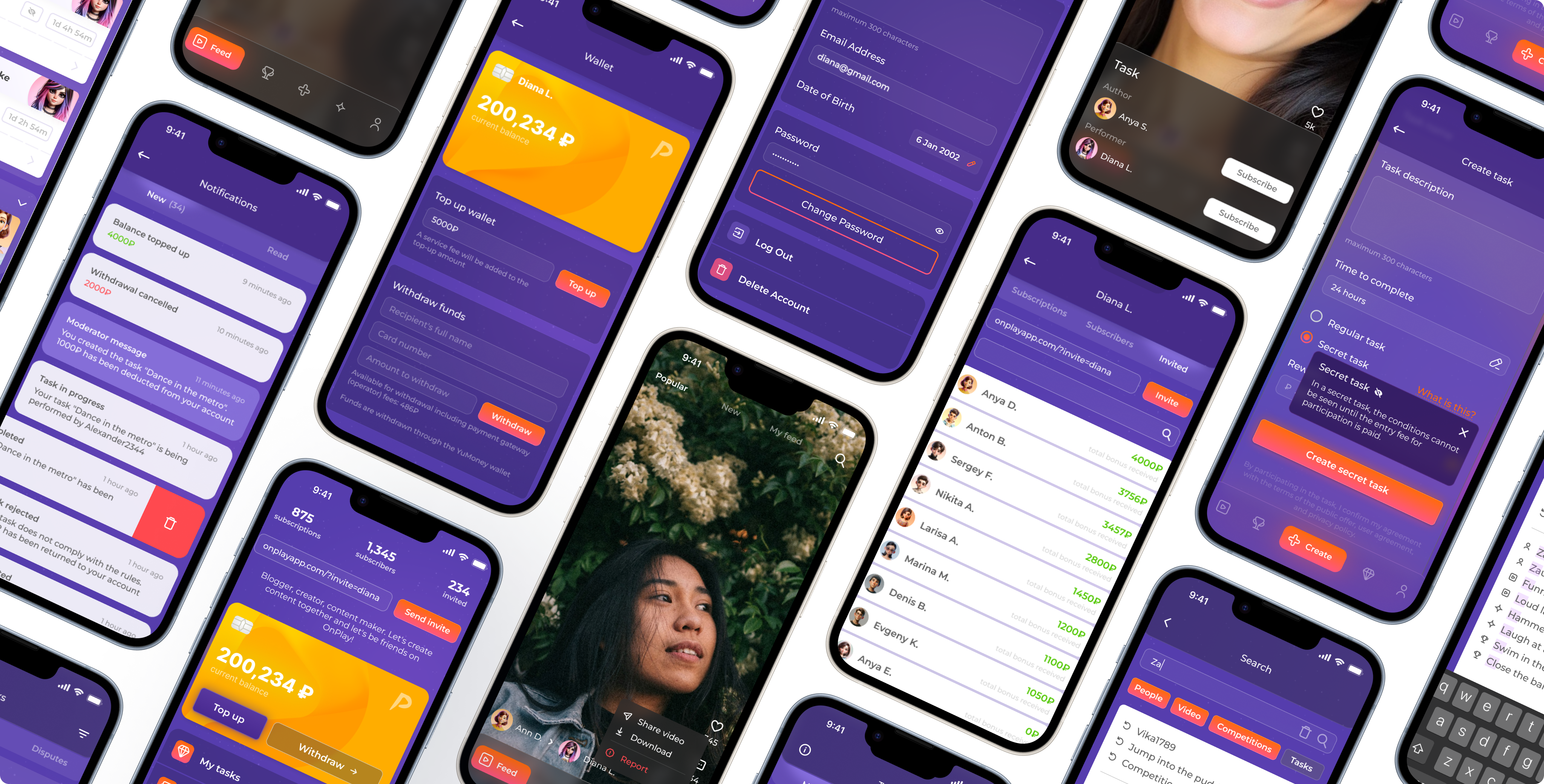
I also redesigned the rest: Profile, Feed, Tasks & Contests creation and edit screens, all kinds of states and transitions for seamless UX.
Impact + What I’d Improve Next
Final impact
- After the redesing was completed we conducted another UX study through Useberry on a sample of 300 participants. Key metrics we aimed at showed signigicant improvements:
- Average Time to Value reduced by 55 seconds (47% improvement).
- Drop-off for Contest screen (the most problematic one) dropped 86% → 29% (dramatic -57% improvement).
- Drop-off at other key screens like Tasks, Contest view screen, Task view screen also reduced dramatically (86% → 36%, 47% → 31%, 54% → 32% respectively).
- Activation Rate increased by 21% (users creating or completing at least 1 task or creating/participating in at least 1 contest).
- UI kit became a reference. Dev team stopped wasting time on questionable UI patterns.
Transformation
- From fragments → to system.
- From guesswork → to measurable UX.
- From outdated look → to competitive product.
What's next
Full-scale launch is expected late December 2025. Once key metrics growth on actual userbase is established, I'd do the following:
- Test new onboarding flows after launch — there are hints that it's gonna improve activation rate, but without an A/B test it's a hypothesis.
- Transfer the UI kit to Storybook once there's enough resources for that.
- Redesign the whole Contests userflow as there are still remains of the old UX present.
 Homepage